
Rebranding A Local Brewery
As a major assignment in my 10th term at NEIT, I’ve been assigned to pitch a Brewery Rebrand, as well as a new line of hard seltzers for the brewery. This assignment was spread amongst 3 classes, where 1 class would focus on designing the new Logo and packaging, and another class would focus on brand aspects like value propositions, target audiences, etc. The last class took care of designing the rebranding booklet.
Chosen Brewery
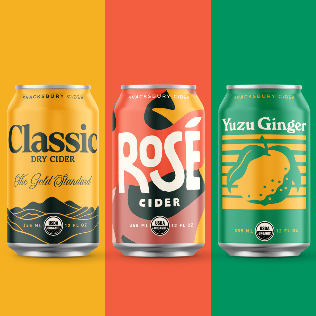
The brewery I chose to rebrand was Shacksbury Ciders, a small local cider brewery located in Vergennes, Vermont. I chose Shacksbury to be the target of my rebrand because while their can designs are very interesting and eye-catching, their logo leaves a lot to be desired. While the logo is fine on its own, A script-heavy logo does not pair well with the simplistic, yet bold graphics and colors that the cans provide. While each can is designed slightly differently, the logo should be able to match each one. Because of this, I knew I wanted to make the logo simplistic, yet bold. It also helps that I already am a fan of their product.
You can find the Shacksbury Website here:

SWOT Analysis
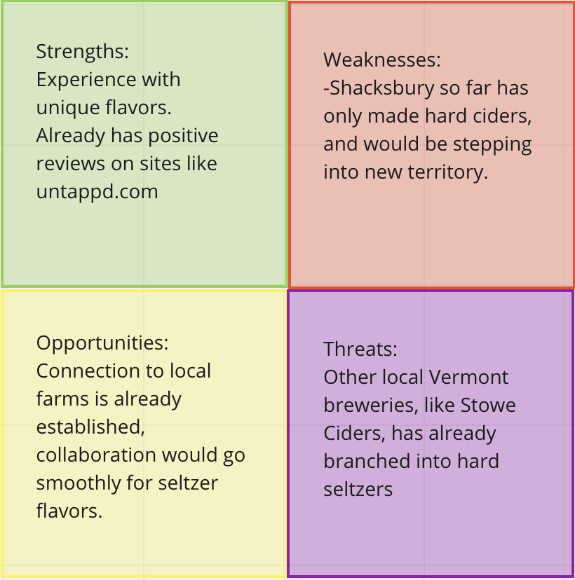
The situational analysis I conducted on Shacksbury Cider showed that while they already have a strong fanbase and the tools and experience to make adventurous and unique flavors, they’ve only ever made hard cider, so they would have to learn the process of making seltzer as well.
I also learned that while other local breweries have been branching out into the hard seltzer market, Shacksbury already has connections to other local farms across the USA, so the process of collaborating with other companies to expand the list of flavors will be easier compared to other breweries.
When you put all of this together, it shows that Shacksbury has great potential in the hard seltzer market, as after they take the leap into the market, they have the ability to introduce new and innovative flavors that use ingredients from local places, something that isn’t done by larger hard seltzer companies very much.
UX Methodologies
For the rebrand, I knew I had to reinforce the affordance of Shacksbury being hip and new. This would primarily be done by changing the logo, as well as focusing heavily on social media marketing. The marketing will primarily stick to Instagram and TikTok, as our target audience primarily uses these sites. The limitations I felt Shacksbury had all resonated with their logo. I felt that, while it did seem like they were a friendly business, I didn’t read naturally from it at all. I also thought the logo was more akin to a candle company than a brewery.
New Value Proposition
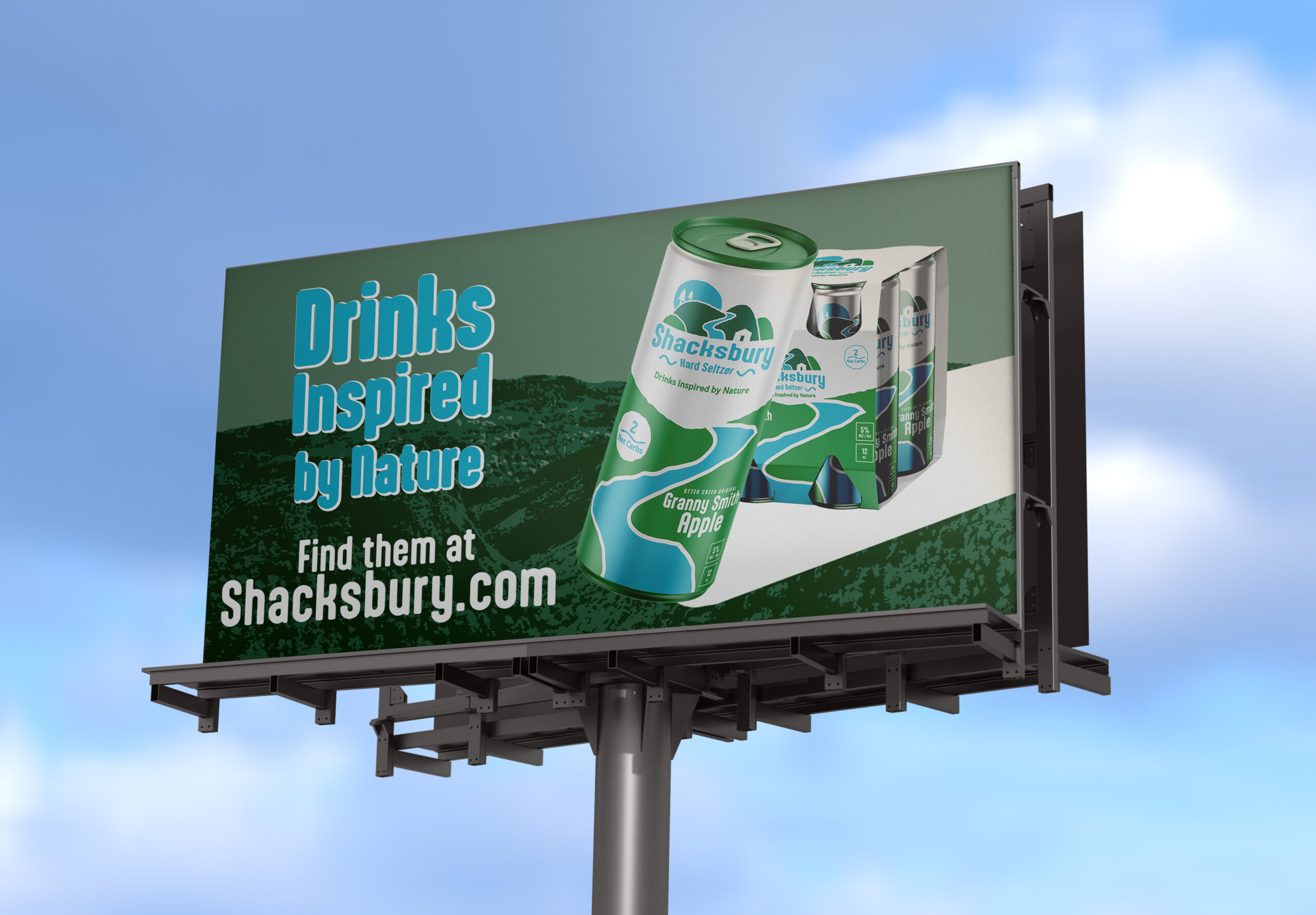
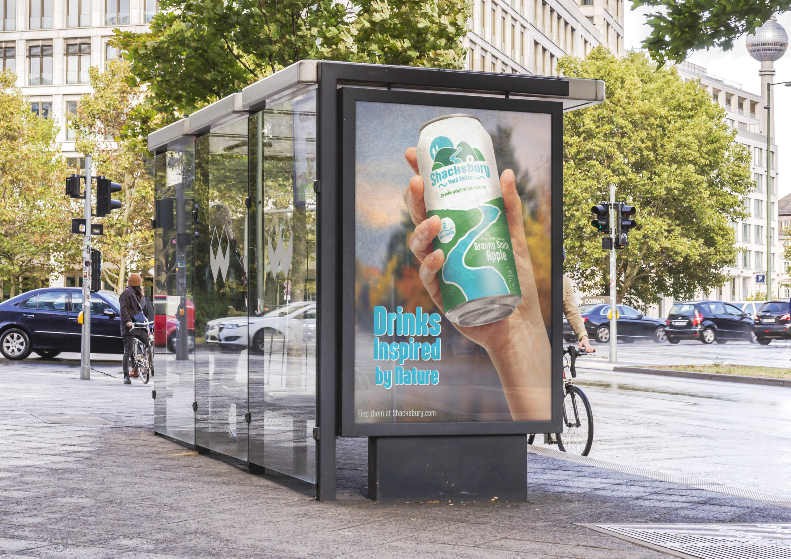
To support the rebrand, a new value proposition was created: “Drinks inspired by nature”. The new proposition is direct and tells the customer exactly what drives the brand. We decided to base the entire rebrand on this new value proposition so that we can keep Shacksbury’s connection to nature and preservation.
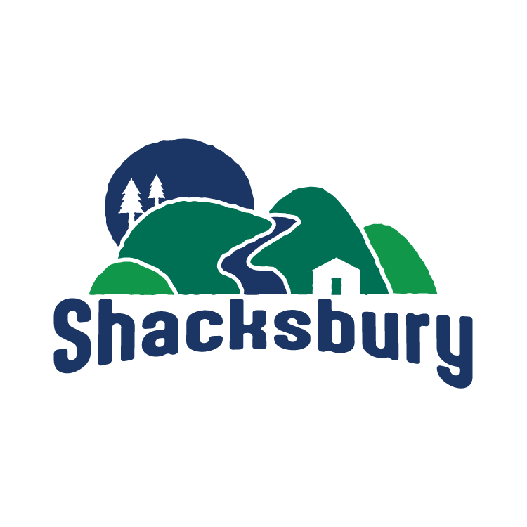
Logo Development
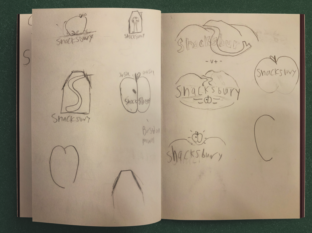
When it came to creating a logo for a Vermont-based Cidery, I wanted their visual identity to match Shacksbury’s roots. To me, that meant apples. The apples, however, became hard to design around and could possibly end up restricting any future brand extensions (like a Seltzer brand). After some brainstorming and critique, I came to a mountain motif inspired by Killington Peak, with a path/river going down the center inspired by Smugglers Notch.
From there, I moved into Adobe Illustrator. For the logo, I wanted the mountain and path to be slightly ridged and imperfect. The Trees and house in the graphic came from the design of their Vermonter cider can.
For the colors, I drew inspiration from the Vermont state flag, which features the blue and dark green used in the logo. The lighter green was chosen to accompany them.
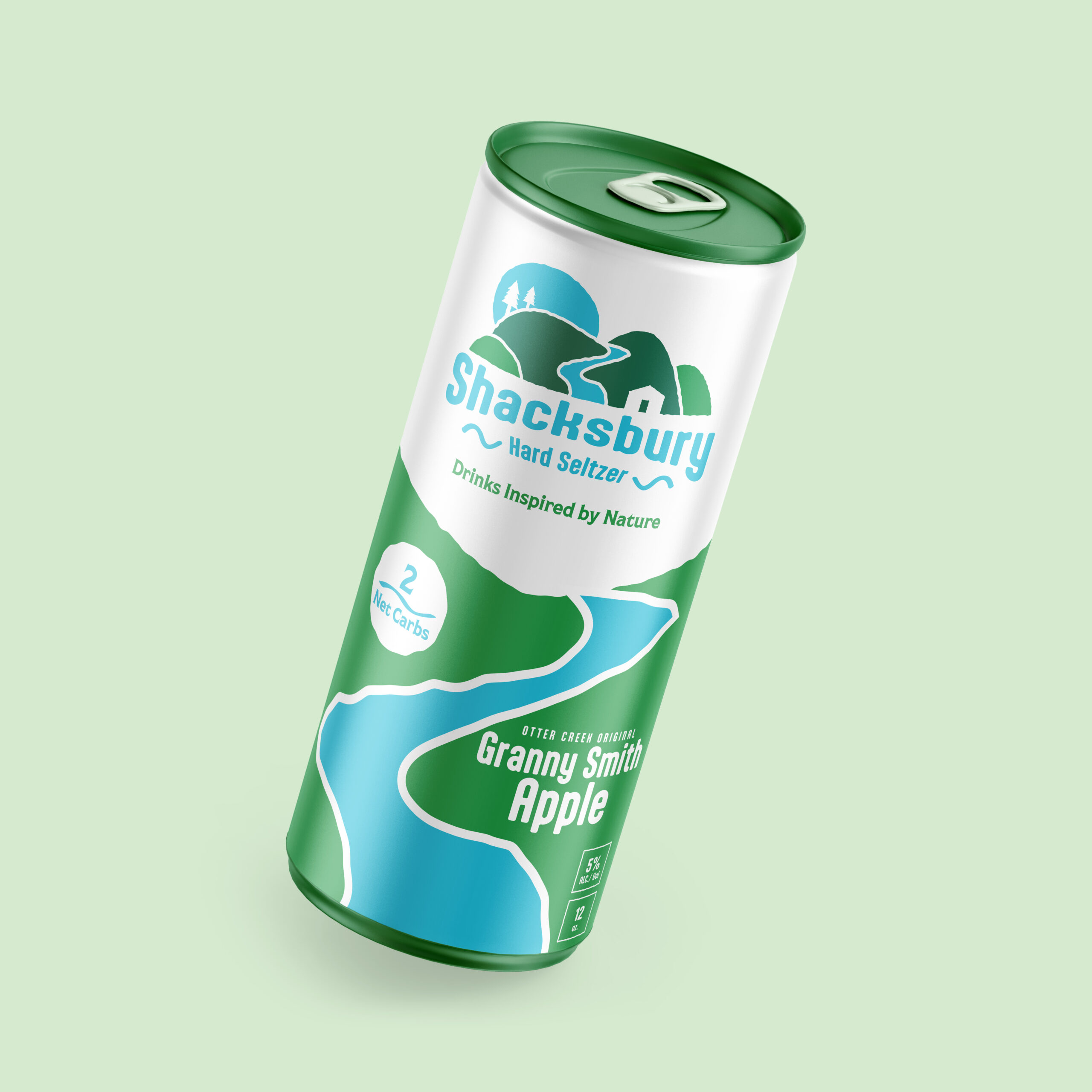
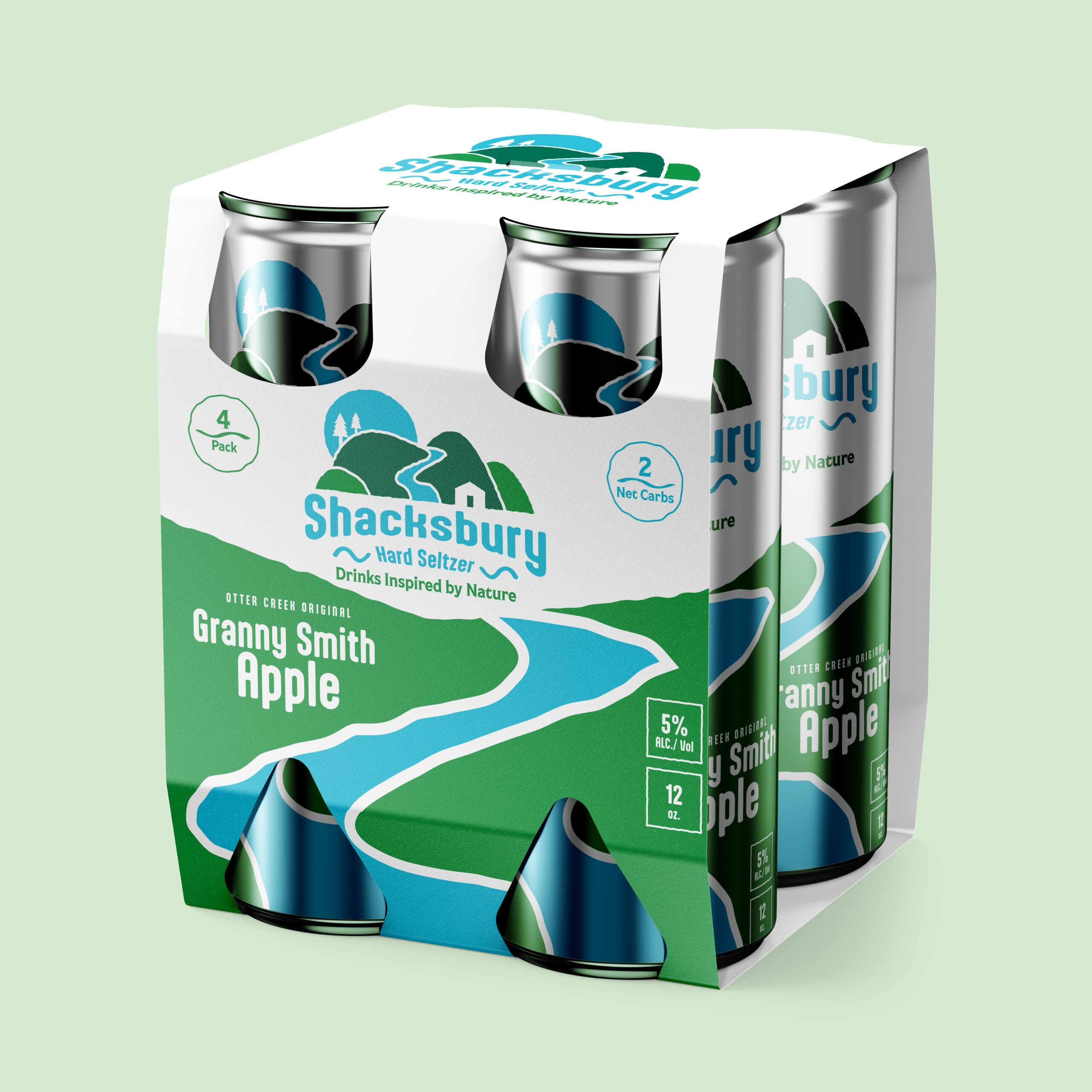
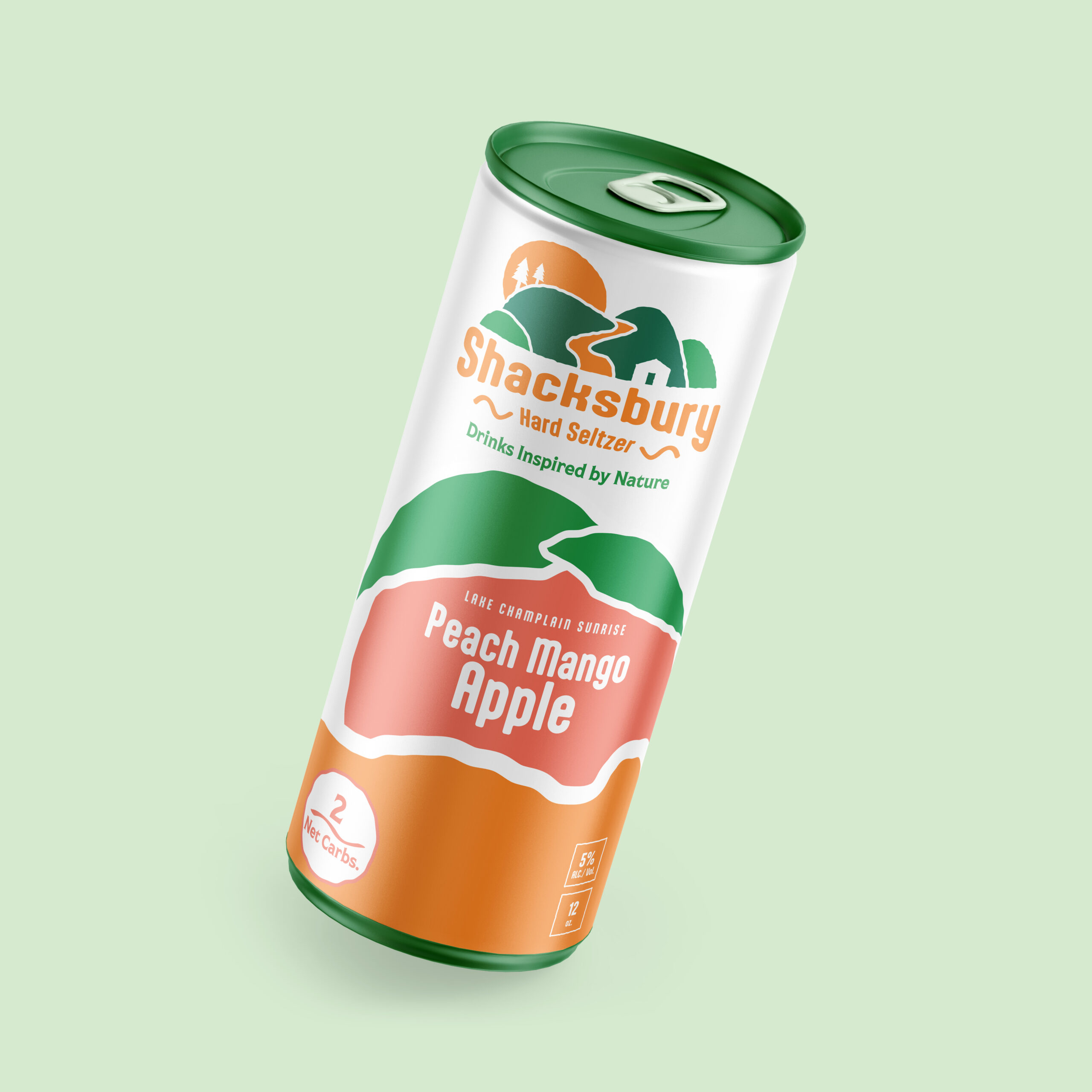
Creating the Rebranded Seltzer
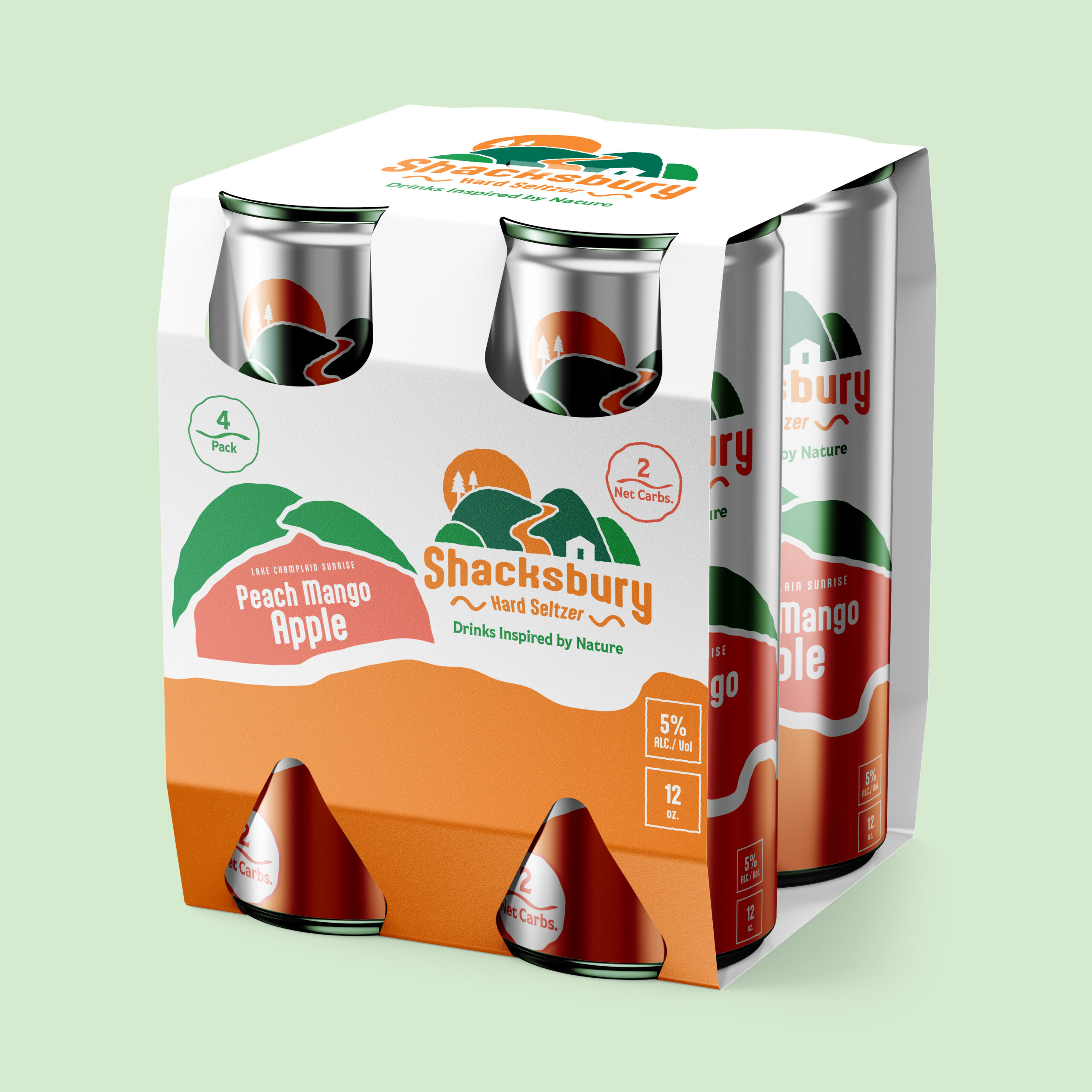
One of the primary pieces of this rebrand was to create a new seltzer line to accompany the brand’s new look. For Shacksbury, I wanted to keep the flavors within the scope of the brand’s original product. To do this, the seltzers all featured apples. Other than the original flavor, however, they’d have more unique flavors that utilized more than just apples.
I also wanted the brand’s colors to change depending on the flavor. This resulted in the sun and river’s blue changing to match the colors of the current flavor.
Lastly, each flavor is named after a body of water in Vermont, which is a nod to the brand’s roots. Otter Creek, the name chosen for the original flavor, is the river that flows through Vergennes, Shacksbury’s hometown.
Below is both the can design and the 4-pack design for the original and Peach Mango flavor.
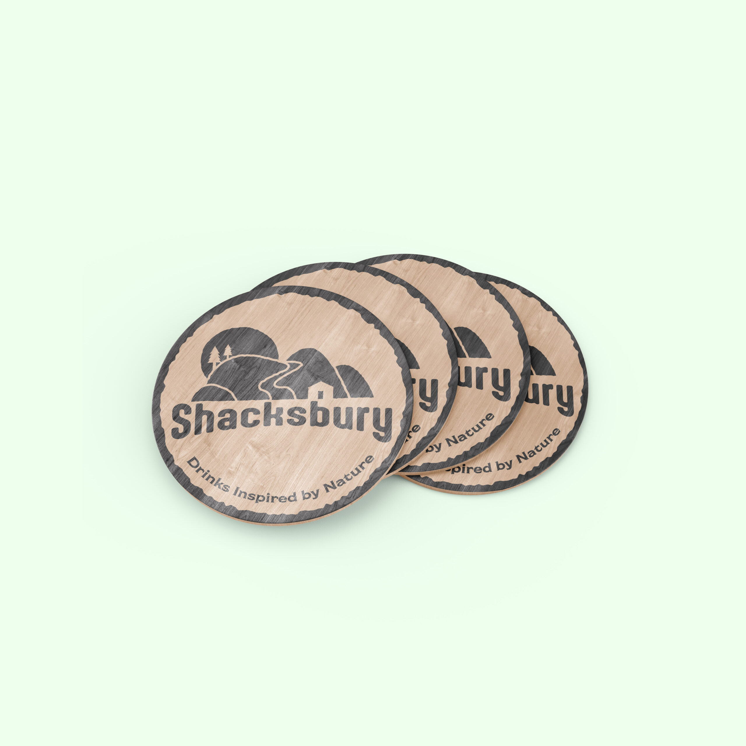
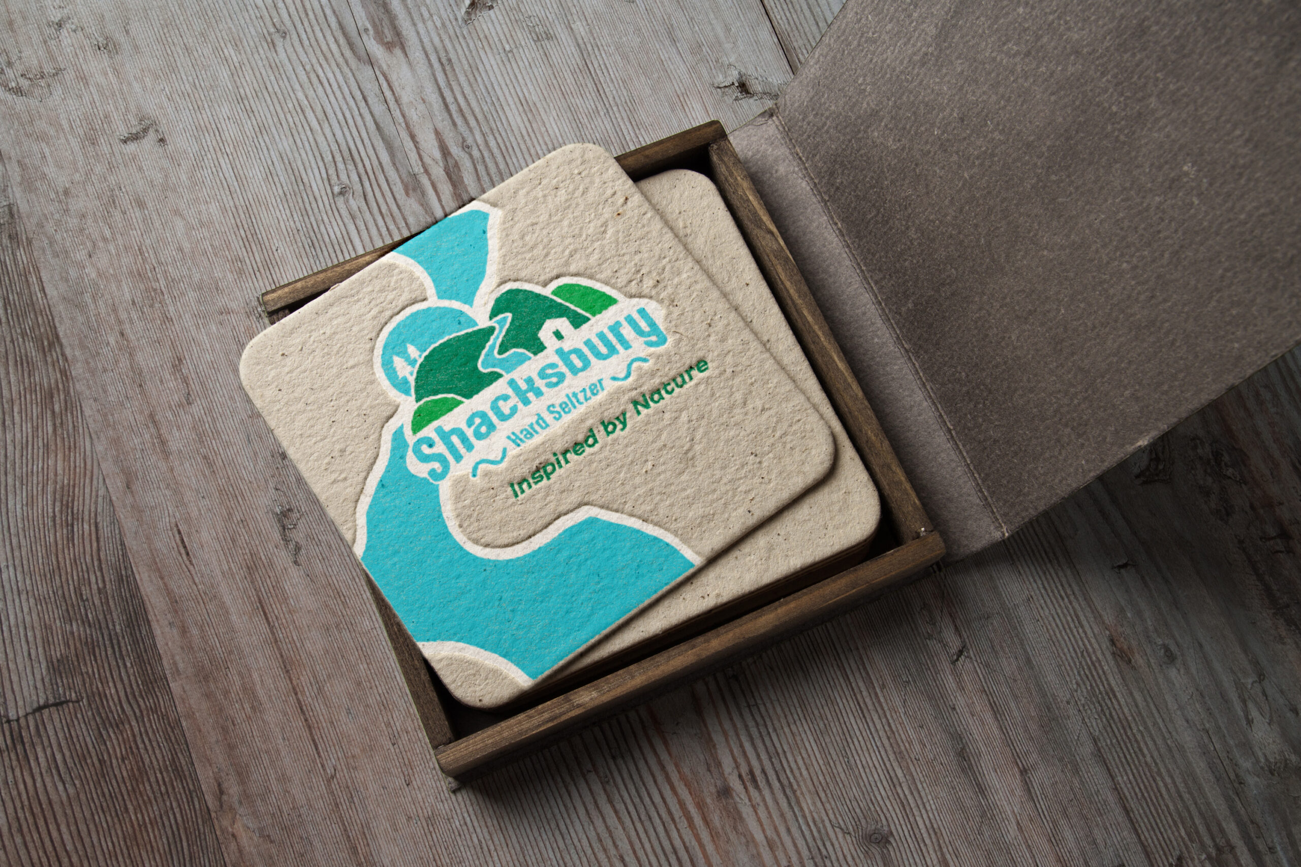
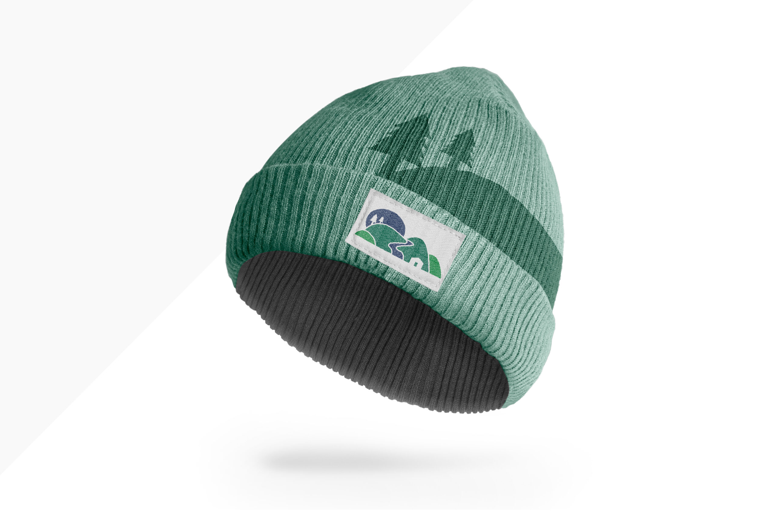
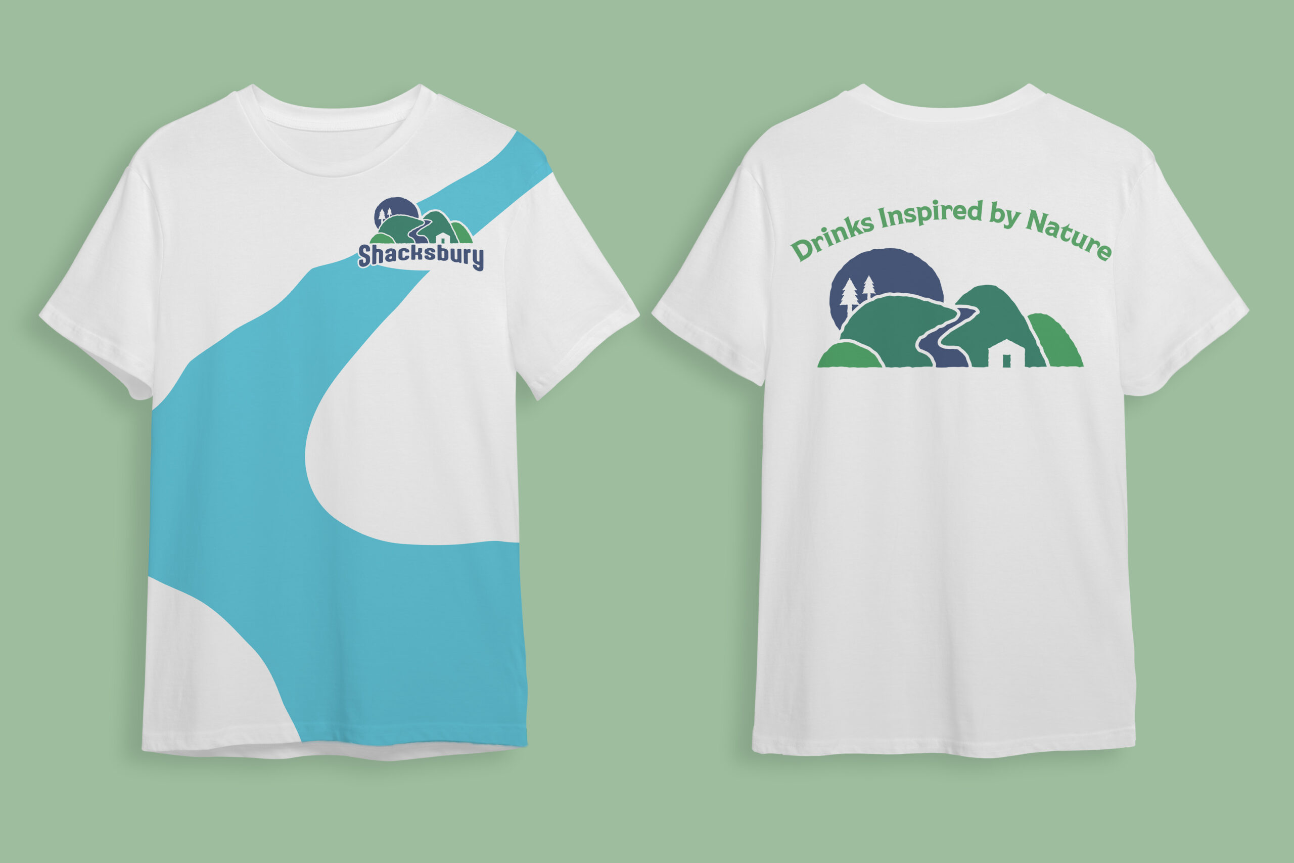
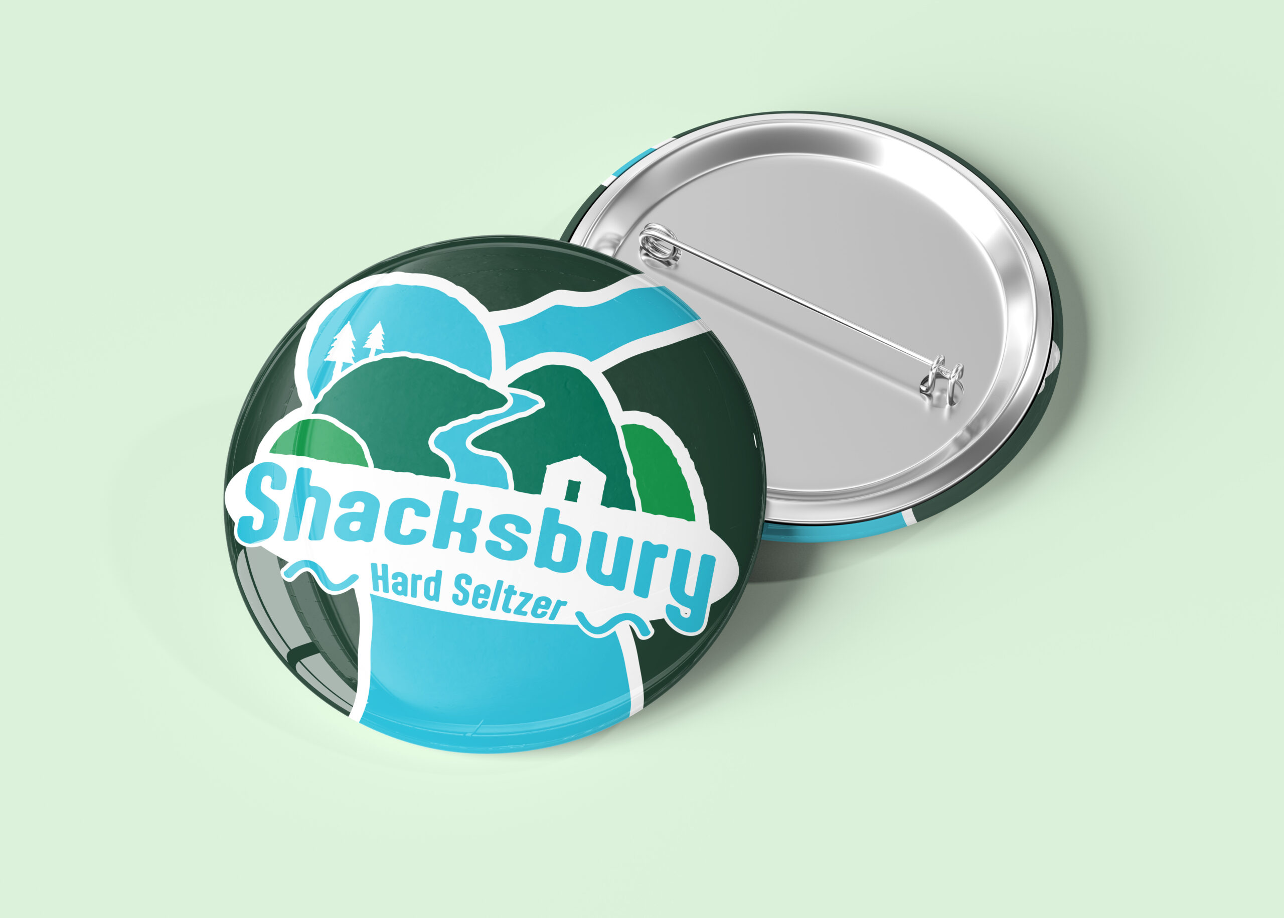
Branded Merchandising
In order to support the new brand identity, I created some branded products that help sell the brand’s new image.
Rebrand Booklet
To wrap up the rebrand, I created a branding guide to explain the rebrand, which you can read below!
Interested in learning more?
Press the button below to see other great designs!