The Premise
For this assignment, we were tasked to make an animated infographic in Adobe After Effects. A majority of the class did theirs on pre-existing infographics that they had completed during their associated degree in the Special Topics class. Because I participated in an internship at the end of my associate’s degree, I did not take this class, so I had to come up with an idea for my infographic quickly. I knew I wanted to do something D&D related, as I am very knowledgeable in that subject, however, I didn’t know exactly what to focus on.
What I decided to choose for my infographic topic was the debate between playing D&D in person around a table, and playing with others across the internet. I knew from the beginning that I didn’t want to favor either side, as I’ve had good experiences with both and can see valid points for both choices. I also chose to only highlight the positives of each side, as many of the negatives from each argument can be very subjective, such as people finding playing online difficult.
The Inspiration
From the beginning, I knew I wanted to have a simple and round style for my infographic. I was heavily inspired by the work of my good friend Caleb Hill over at ChillDesignCo.com, and his animated diorama.
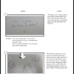
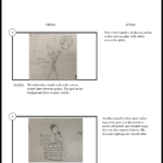
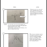
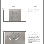
To begin the creation process, much like every other project, I began forming a storyboard. This way, I knew what assets I needed to design, and what I needed for a script. I formed the storyboard around simple sketches, which allowed me to convey my ideas before putting time into fully animating the infographic. The use of storyboards also allowed me to receive critiques of my framing and animation. To further convey my rough ideas, I also created an animatic to display the initial framing of the infographic
Adobe Illustrator & Adobe After Effects
After settling on the framing of the infographic, it was time to start making the assets. I initially made the characters I needed and would create more as I needed them. I went for a very simplistic style. I created knights, elves, and even wizards. I made their joints very pronounced so that animating them would be simple if I needed to pose or move the limbs. For the typography, I used Work Sans, as it’s a nice simple font that is easy to read. The assets were made in Adobe Illustrator, with each asset being on a different layer in the document. This way, I could keep all my assets together in a single file, while being able to use them separately in Adobe After Effects.
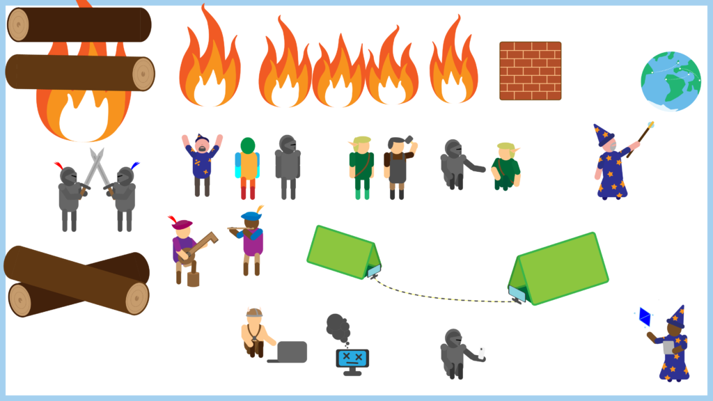
After creating the assets, I imported all the assets I created, as well as some music, into Adobe After Effects.
In order to keep the amount of assets to a minimum per composition, I split the animation into 4 parts and transitioned between them using motion blur to convey that the camera moves a long distance.
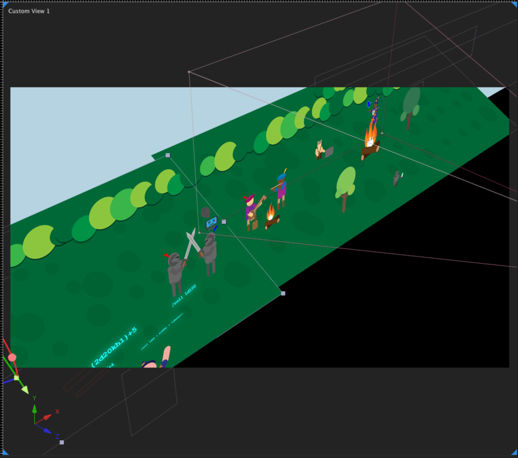
Similar to my diorama, I made the animation by animating 2D assets in a 3D environment. This makes it easy to add depth and an interesting parallax effect when the camera zooms in.
In the end, it all comes together to form an entertaining infographic that summarizes some of the benefits of either playing online or in person.
Here is the final product below! If you enjoy it, be sure to check out my other work here!

