Making a magazine cover for Mirrorscape’s ARcana.
For my first project with Cinema 4D, I was tasked with making a magazine cover. For this magazine cover, my intention is to attract the attention of those not just into games like Dungeons and Dragons, but also those who are interested in rising technologies like AR.
Mirrorscape and ARcana
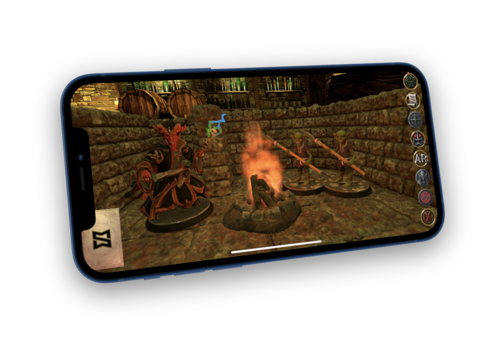
Mirrorscape is the small team behind ARcana (Ar-Cah-Nah), an app designed to combine the power of Augmented Reality and D&D. The app allows players, whether they’re around the table or around the world, to simulate D&D terrain maps. The Kickstarter Campaign is fully funded, and at the time of writing, has 28 hours left until it closes.
The Problem
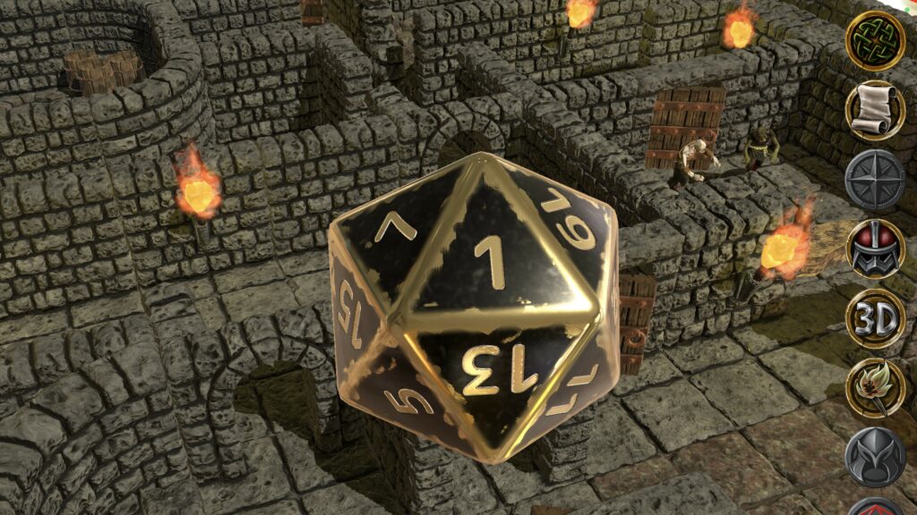
While Mirrorscape’s Kickstarter campaign has been a success, the only imagery they have to show off has been taken from the app. When they needed imagery for a cover for Tabletop Gaming magazine, a screengrab of the app wouldn’t have been the best choice as the game resolution, which is meant for a mobile device, may not look the best on a wider display like a magazine.
Because of this, they wanted to use a completely new 3D design for the magazine cover. A design that would incorporate the transition between D&D and the technology that ARcana provides.
For the design, I had to keep some key points in mind:
- The design has to convey fantasy aspects.
- The magazine title must relate to both fantasy and tech
- The design must depict AR somewhat, without showing a cellphone
The Solution
Early Concepts
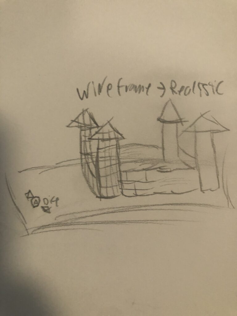
From the start, I had a general idea of how I was going to approach this challenge. My original idea was to design a castle on a table, fading from a wireframe to a fully textured castle. I had to emphasize that while the app provided a new way of playing, it still held the values that make D&D so great. A Dragon was also considered for the design, which would represent fantasy, however, it wouldn’t have made an easy transition to a wireframe. Using a dragon would also incorporate unnecessary details, which when making a magazine cover is a big limitation. It’s easy to incorporate small details, which may either distract from the overall design or simply be ignored overall, wasting effort.
Developing the
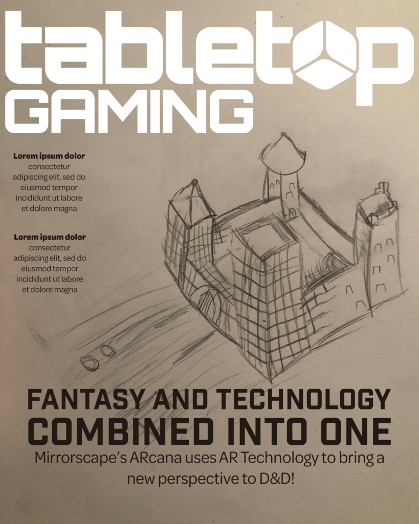
Cover Layout
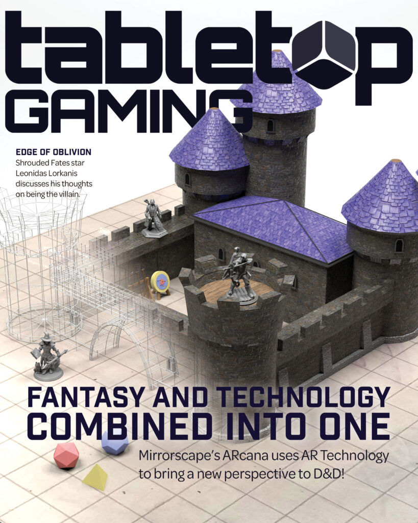
For the magazine cover, the top portion of the layout is taken up by the logo of the magazine. This luckily was not a hindrance, as the design is very horizontal. I used a simple sans-serif font, and for the final design decided on a dark crimson for the title. I chose red as the title cover because the Dungeons and Dragons brand uses red as its primary color, and ARcana is D&D Adjacent. A red goes well with the final black of the magazine logo.
For the title, I chose to go with “Fantasy and Technology Combined into One”. I decided to not add AR or D&D into the title itself, as I felt it would complicate the title with brands and technical terms. The title is mainly used to attract the attention of readers, saying how the app combines two different concepts: Fantasy and Tech.
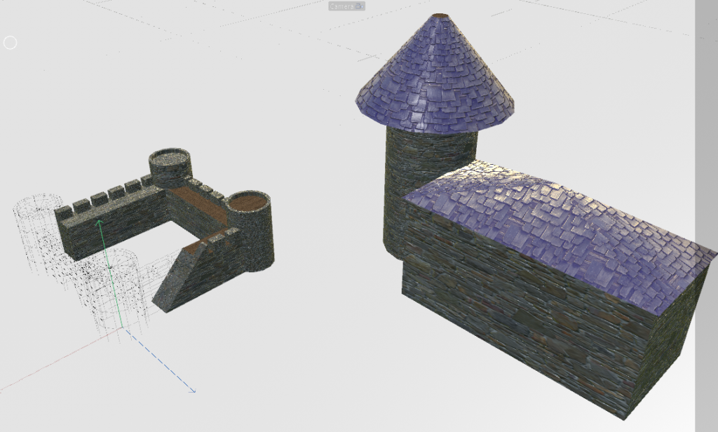
Into Cinema 4D.
For the final design, I swapped out having the castle on a table, which would complicate the design, to using a grid on a white floor. This is akin to dry-erase battle maps that many players, like me, use. Transitioning from a grid, with dry-erase smudges to wireframe, to an HD Castle render represents the transition between reality and AR technology.
