
Finding a Coffee House
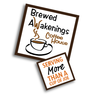
Back in the fall of 2021, we were tasked to pick a coffee shop local to Rhode Island and rebrand it to enhance its strengths and remove its weaknesses. I decided to focus on Brewed Awakenings, a small Rhode Island chain of coffee houses that offer good food and naturally flavored coffees. I specifically focused on their Warwick location on Bald Hill Road, but the branding can apply to all of them.
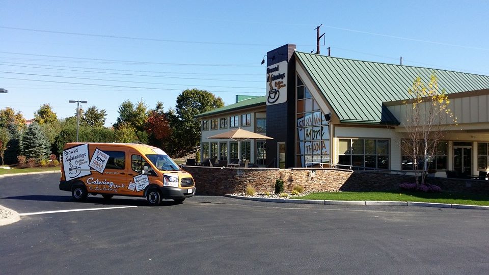
Some important information about Brewed Awakenings is that they already have a strong social following. Some of their locations also offer full-service bars in the evening, and their Johnston, RI location frequently has live music. Additionally, their Cherry Hill and Warwick locations feature a Drive-Thru, for quick service.
You can find their website by clicking here or using the button below!
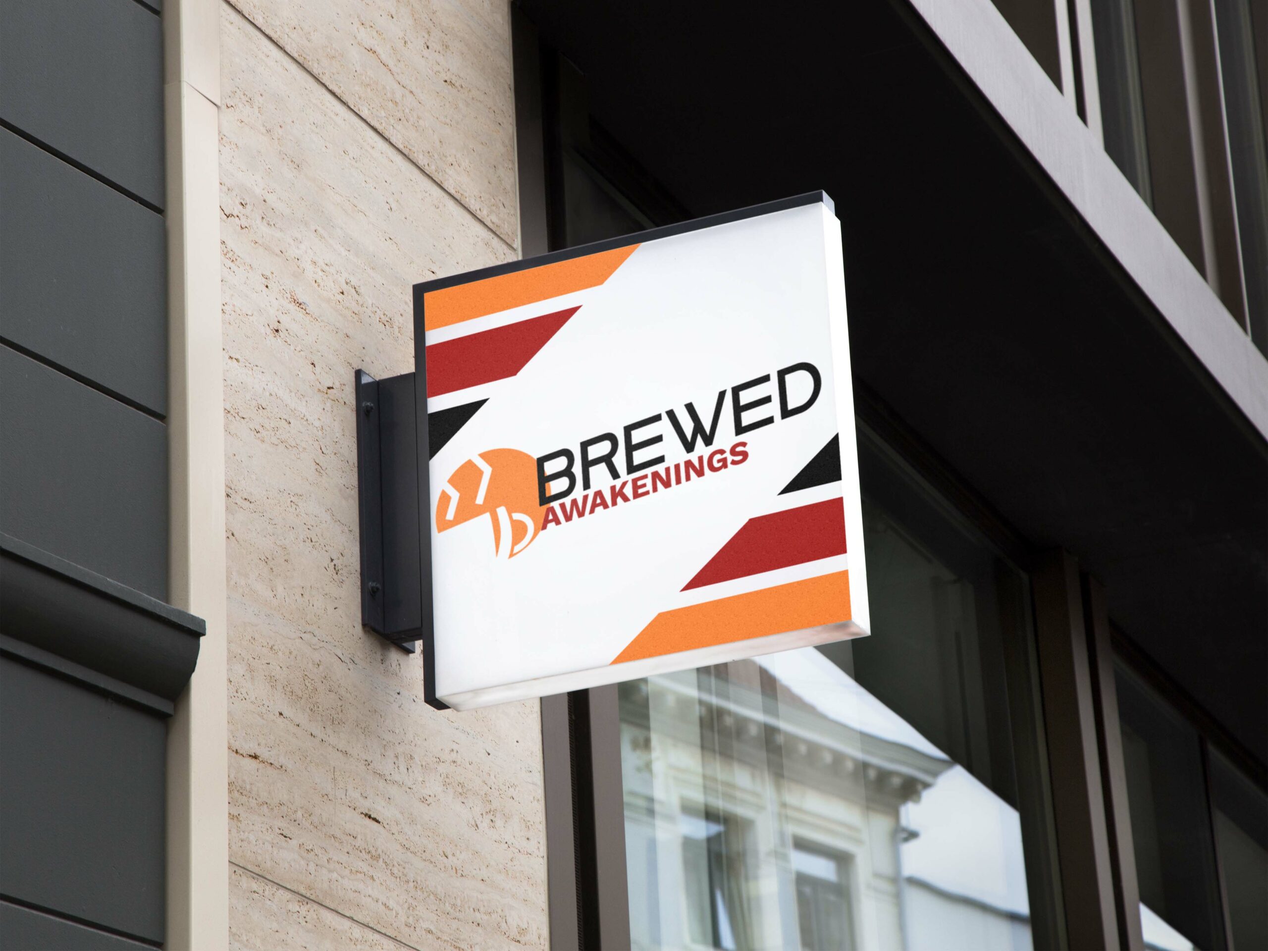
Rebranding Brewed Awakenings
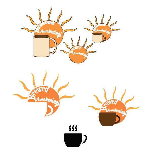
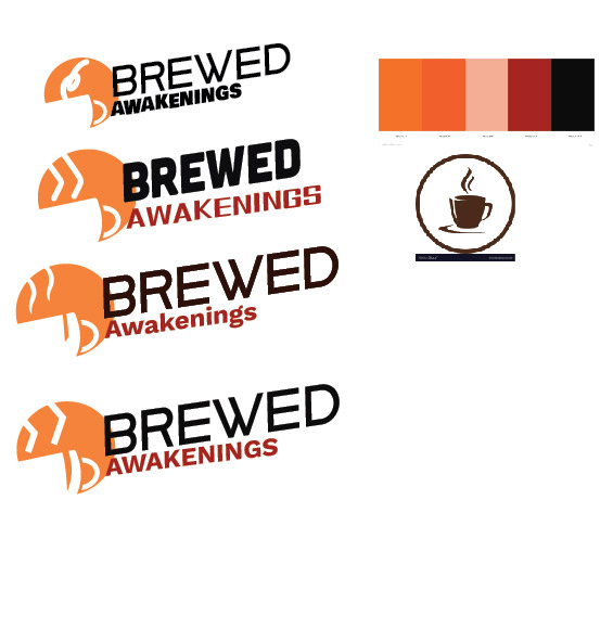
When I started designing a new logo for Brewed Awakenings, I knew I wanted to include two primary elements: The sun, and a coffee cup. Originally, as you can see, I started with a perfect orange circle for the sun, extremely wavey sun rays, and a very crude mug. Over time, the overall height of the logo decreased, and I started playing with the idea of using negative space to show the mug, instead of it being another element. I then scrapped having the text inside the circle, as well as the sunrays. I wanted to make a clean, modern logo, and with the right font choice and tweaks to the coffee cup cutout, I managed to create a logo that was able to look clean, while still giving off a warm and comfortable feeling with its colors. Originally, the cutout was transparent behind it, but I decided to add a cream fill-in behind it recently so that the shape wouldn’t get lost on certain backgrounds.
More than just a logo
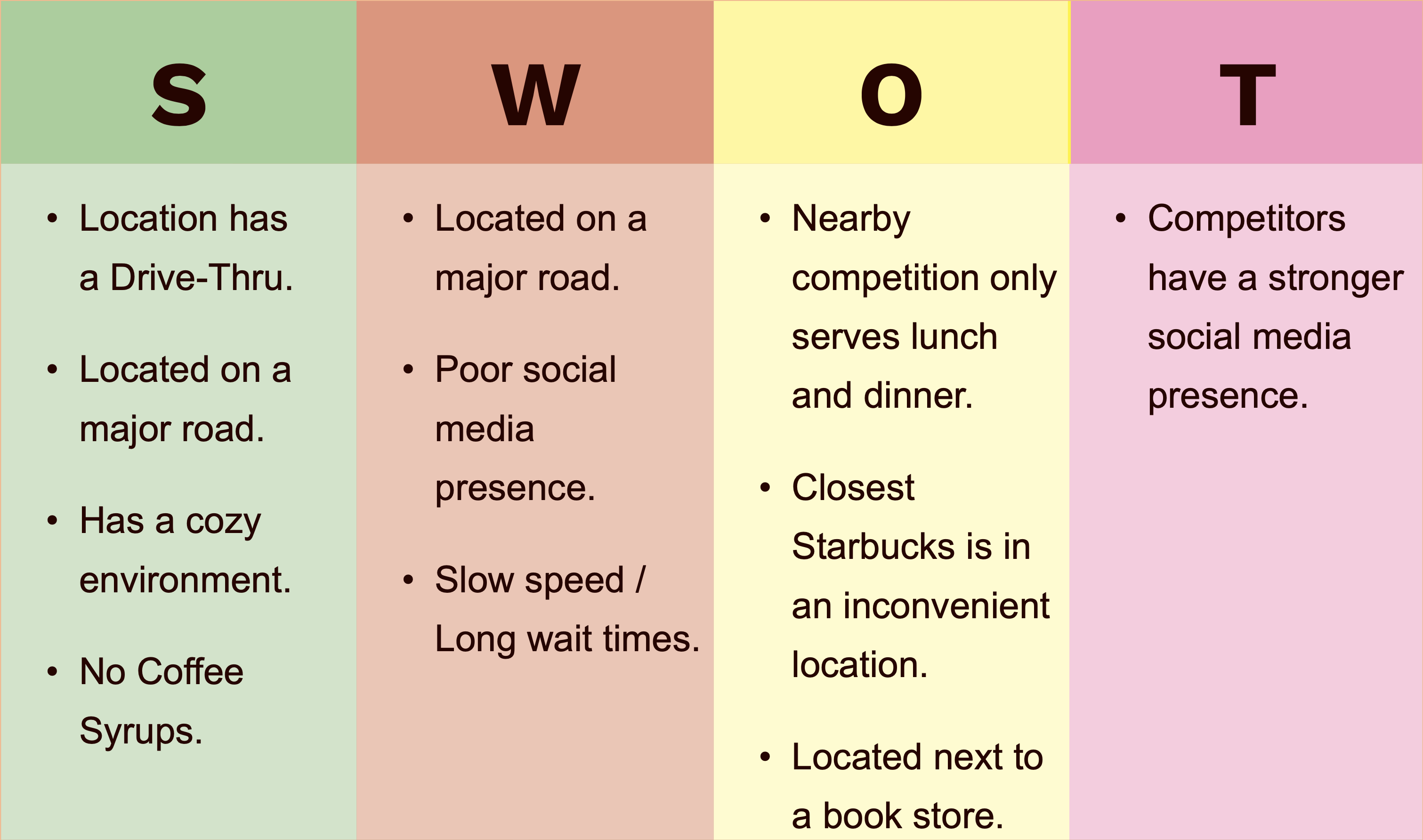
In addition to a new logo, I wanted to look at the user experience of the average Brewed Awakenings customer and see what could be improved. To start this process, I created a SWOT (Strength, Weakness, Opportunity, Threat) analysis to get a top-down view of the brand. I placed “Located on a major road” as both a strength and a weakness as while its location can attract a lot of customers driving up and down Route 2, the road may prove to be quite noisy to people who are looking to use this location as a place to work. The main takeaway of the analysis was that Brewed Awakenings Warwick has a lot going for it physically, but was lacking online at the time of the rebrand. They have now updated their website and added rewards, as well as have been frequently updating their social media pages.
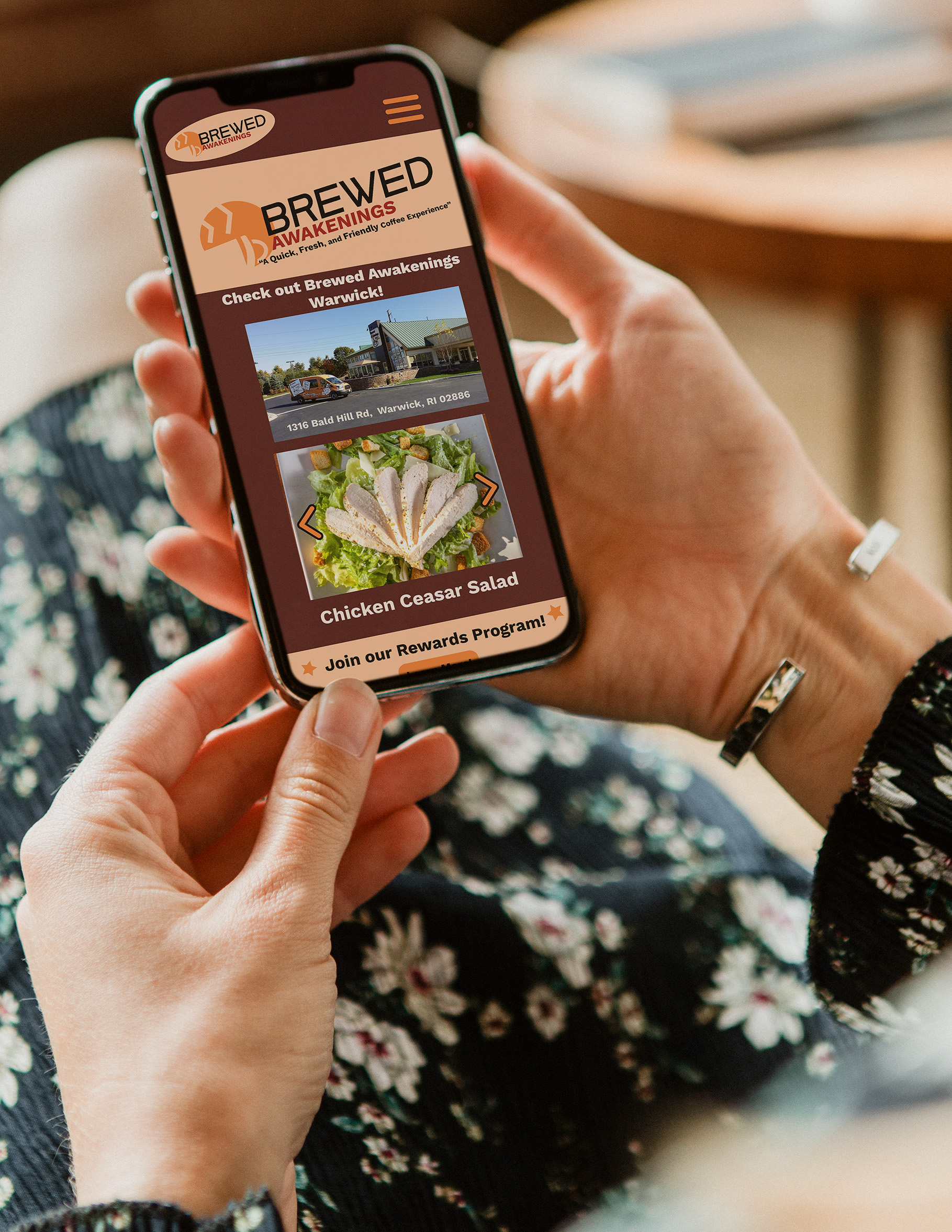
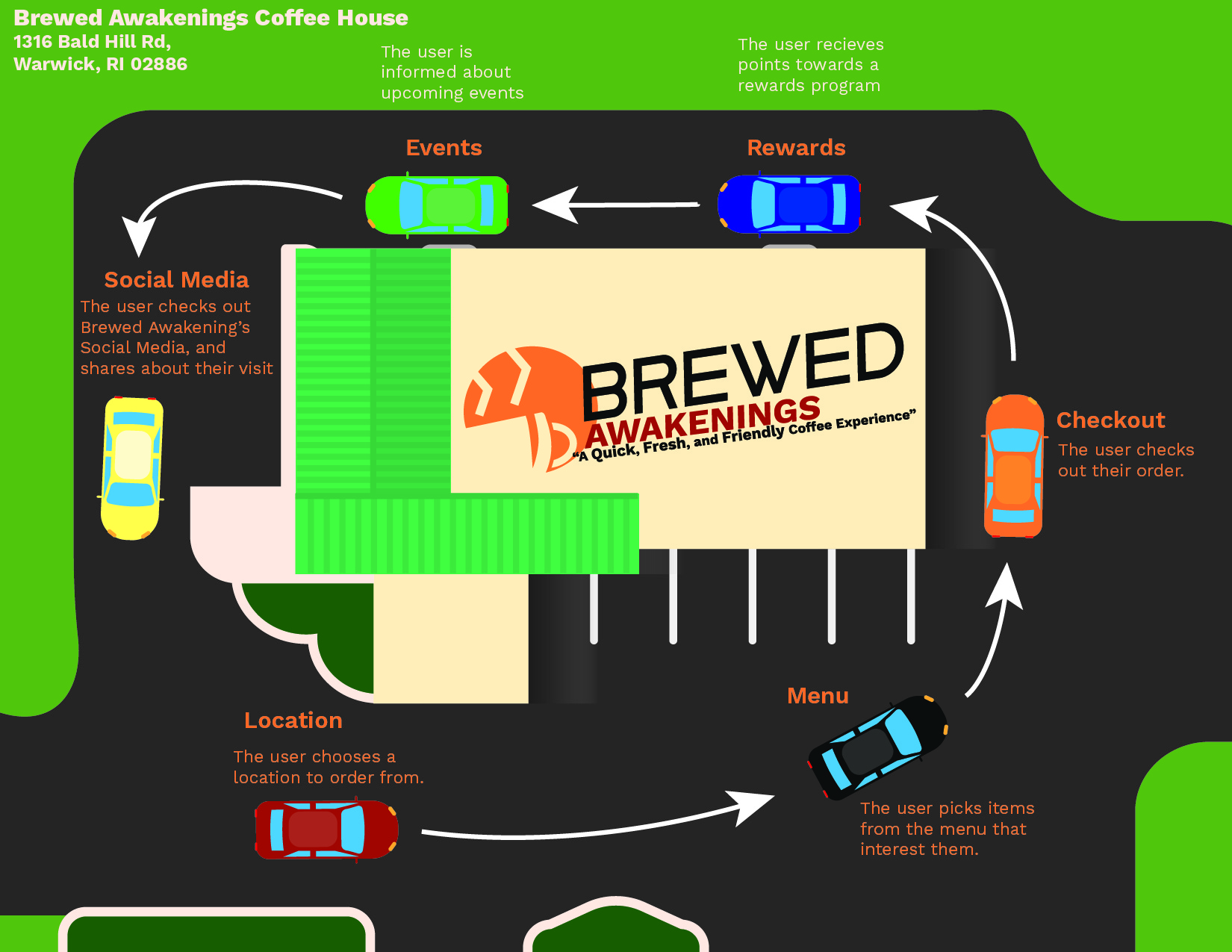
To assist with their online presence, I designed a mockup of a mobile app for Brewed Awakenings. With this app, users would be able to place orders before arriving at the store, earn points through a rewards program, and be informed about upcoming Brewed Awakening events happening at their local store. Additionally, to improve their social media presence, Brewed Awakenings should hire a social media manager to keep their Facebook and Instagram frequently updated, as well as answer complaints the store may get through these platforms. Lastly, I created a journey map to explain the process of a customer ordering through the app.
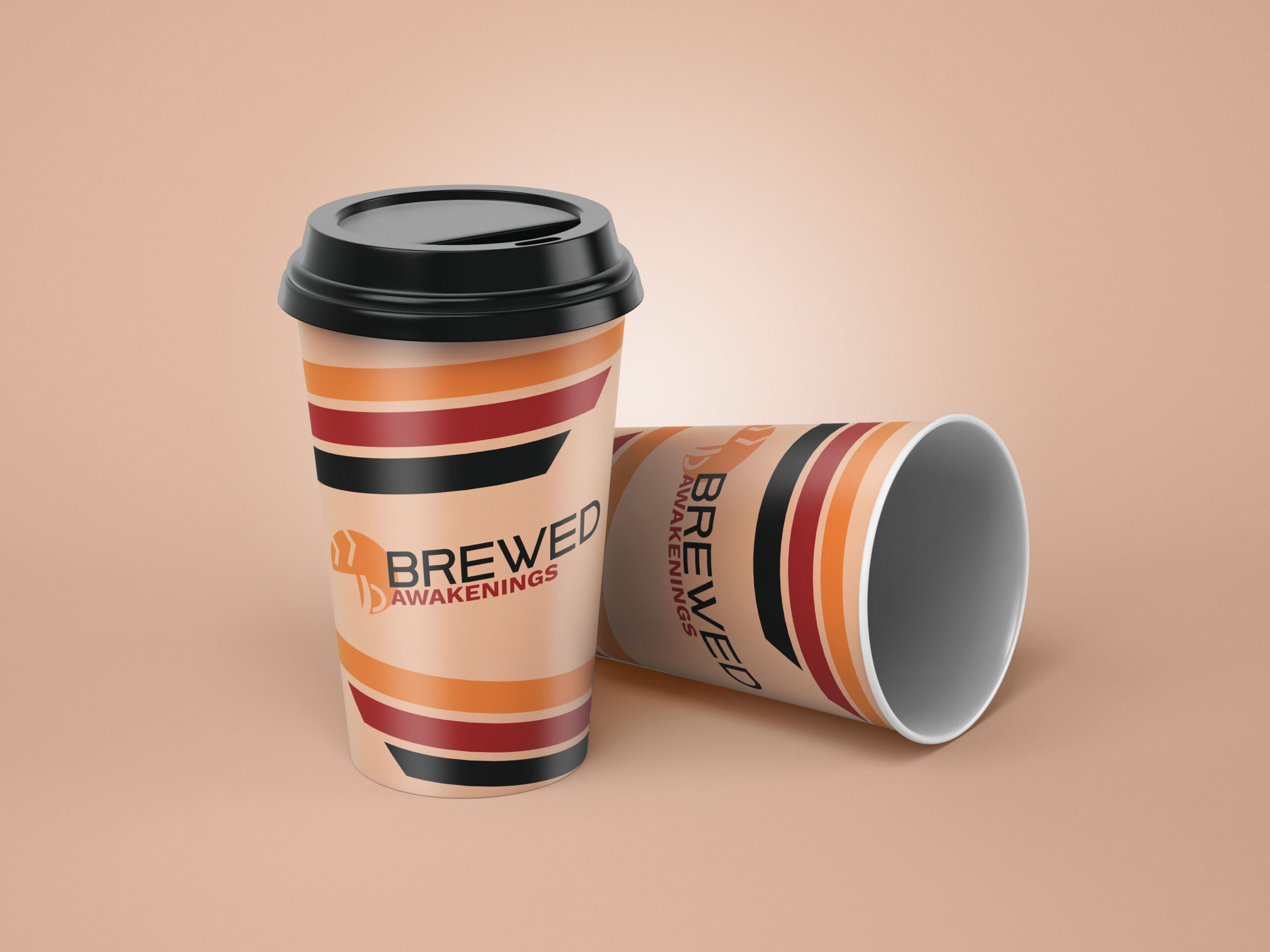
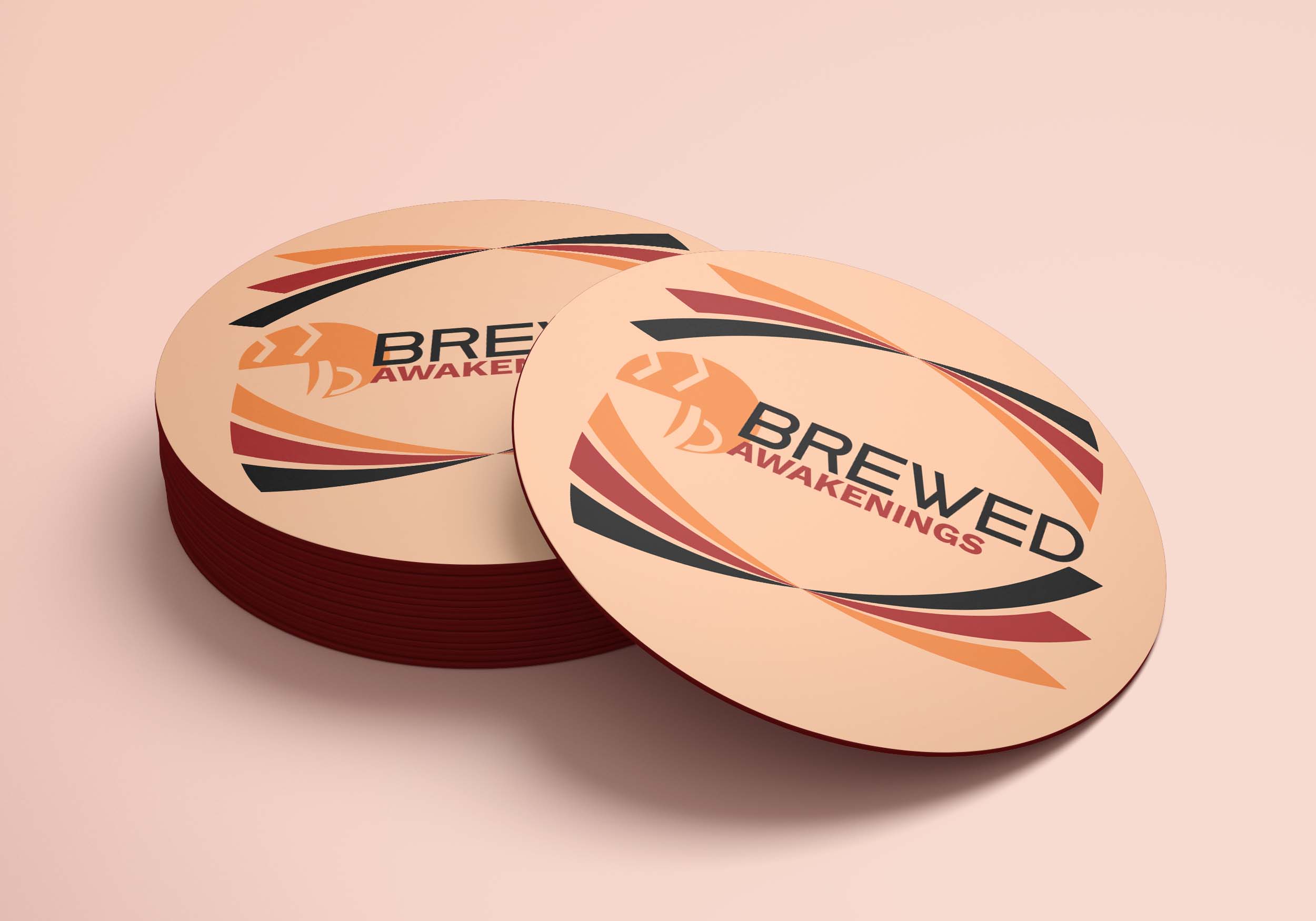
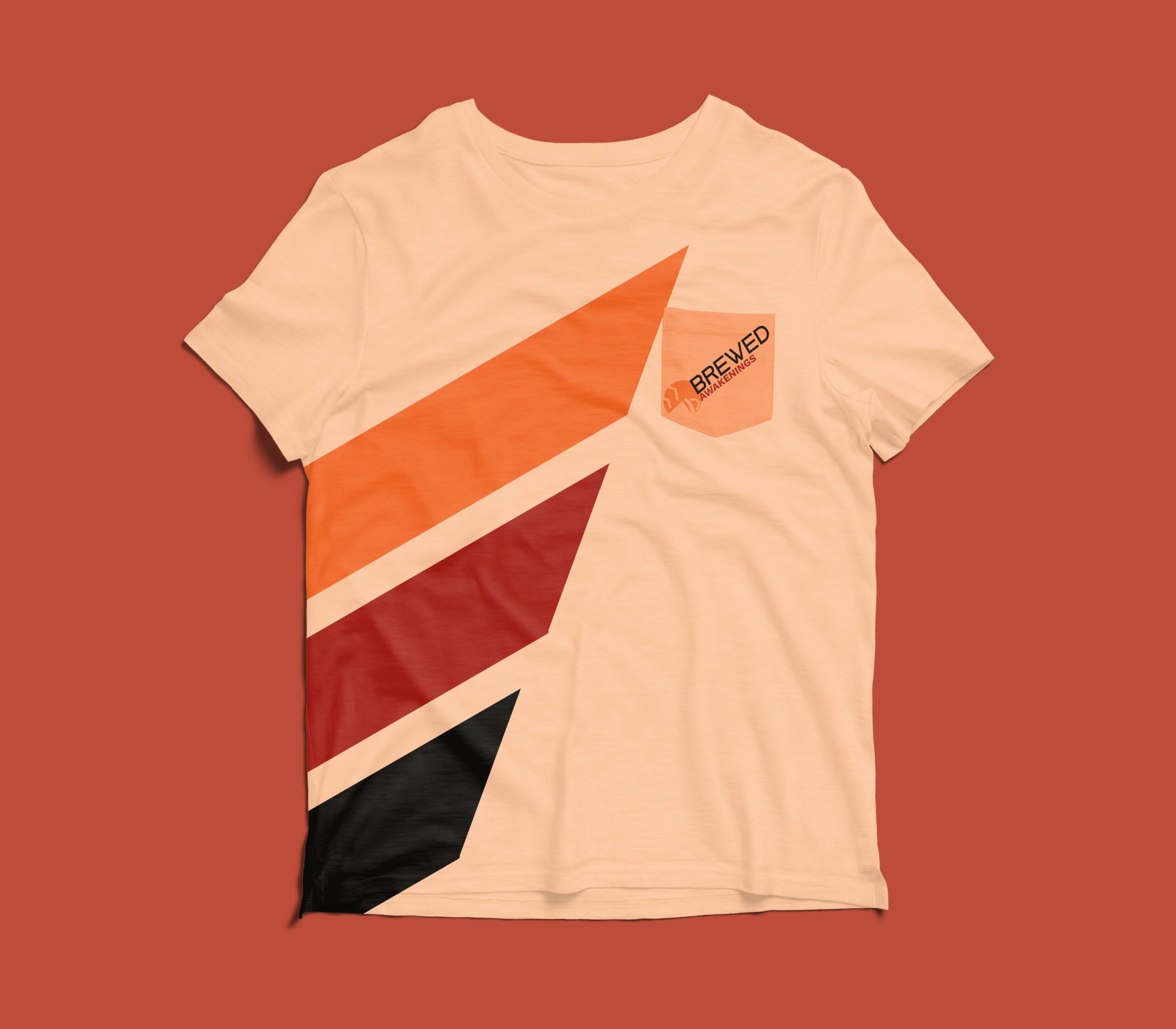
Merchandising
In addition to an app, I designed some additional Brewed Awakenings branded merchandise!
If you’re interested in seeing other Red Crab Design rebrands, check out our rebrand of Shacksbury Ciders!